By Brittany Piper
No one wants to give Google more money than they need to. Landing page optimization is a powerful way to drive more leads and a better ROI without spending more money in PPC engines. Landing page optimization (LPO) is often something that is overlooked or not given as much thought as it should. Here are my top 10 landing page recommendations that can help you win big:
1. Dedicated Landing Page
This first one sounds obvious, however, in my experience, I have seen too many advertisers driving their paid search traffic to a homepage of a website. If you are running display efforts the normal website may work just fine, but this lower funnel traffics requires a different experience highly focused on conversions to get the most from your marketing dollars.
2. Clear Call-to-Action
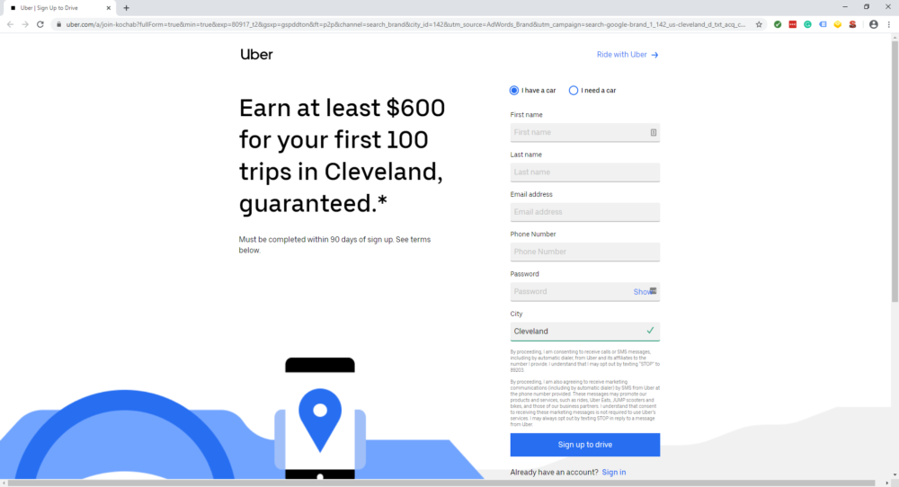
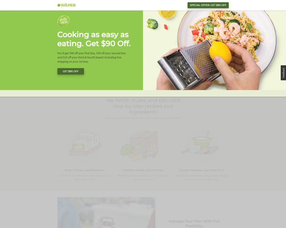
What action do you want a user to take? Do you want them to call you? Fill out a form? Watch a video? The action you want them to take should be quickly identifiable by the user. Using contrasting colors for a button or text helps users’ eyes go immediately to what action you want them to take.
3. Above the Fold
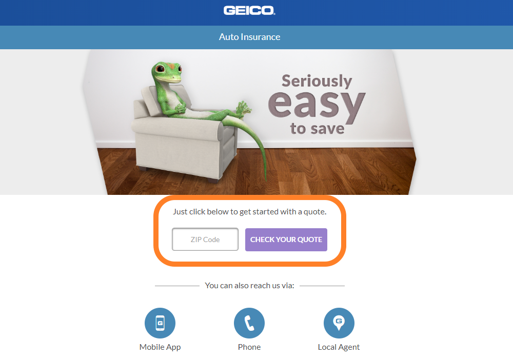
The Clear Call-to-Action should appear above the fold of the page. You will miss out on conversions if you don’t provide this experience as soon a someone loads the page. People don’t want to have to scroll to engage with you.
4. Fast Page Speed
Speaking of a page loading…. It is critical the landing page has a fast load time. According to Google, 53% mobile site visits leave a page that takes longer than three seconds to load. You can test your page here.
5. Mobile-Friendly
The engines, especially Google, also put heavy weight on your page being mobile friendly. Not only does a mobile optimized page provide the best user experience but it can also help your ad rank and decrease the cost per click you pay. You can test your page here.
6. Limit Exit Points
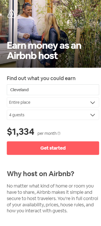
One of the main reasons to not have traffic go to a regular site is to be able to control the number of exit points. An exit point is any link that takes you off your current page. Traditionally, websites have a navigation bar, internal links near the bottom of the page and social icons. This gives users too many opportunities to jump off your current conversion-focused page. Keep these exit points to a minimum (if any at all) to keep users focused on the action you want them to take.
7. Provide a Consistent Experience
Not only does keeping the same message consistent from ad to landing page provide a good user experience, but the engines also take this into consideration in their algorithms. The ad that appears should make sense for the keyword being searched and the message in the ad should be reflected on your landing page.
8. Minimize Content
Give someone enough information about your service/product to entice them to complete the action without overwhelming them with information.
9. Build Trust
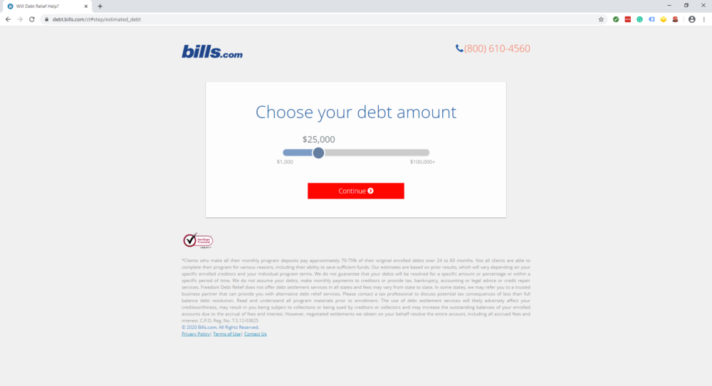
Make sure to call out any awards you have received or any special certifications you have to show your quality. Customer testimonials are also a great way to build trust. Think about the last time you bought something or signed up for a service, I’d bet you looked at a number of customer reviews before making your final decision. Highlight your good reviews and if you can, choose ones that mention something you believe to be an advantage over your competitors.
10. Always Be Testing
Last but not least, never settle for your current performance! Always have a version A and B, or a multi-variant test running. I like to use Visual Website Optimizer for my testing. Try moving a form to the other side of the page, shortening the number of fields you ask for, changing your call to action… the testing possibilities are endless!
About the Author
Brittany Piper has been in the digital advertising industry for 10 years. She has been with ChoiceLocal for over three years, leading the paid advertising strategy and franchise marketing. She enjoys watching superhero movies with her husband and long walks with their two dogs.

