When Was the Last Time You Optimized Your Landing Page?
When it comes to the wild world of Pay Per Click (PPC) – there are a lot of variables at play. You’ve got keywords, locations, devices, ad schedules, demographics, and a bunch of other detailed targeting options. All of which are important and the key to having a successful PPC campaign. But there is another key part that tends to get overlooked by many marketers.
The landing page.
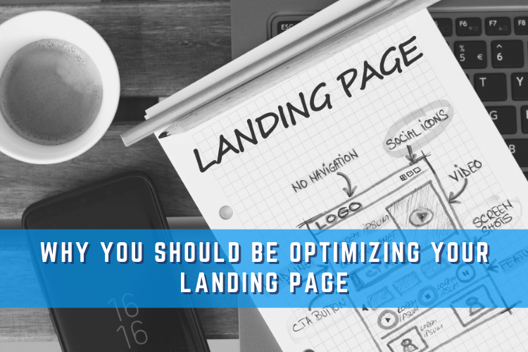
Obviously, the people who click on your ads are getting sent to the landing page (if they are not that’s a completely different issue for another blog). But landing pages can sometimes get overlooked and become a set-it-and-forget-it type of deal. And while you might be paying attention to your google ads’ account optimizations, the optimizations you can make on your landing page are almost as equally important in ensuring you are getting the best results you possibly can.
What to Optimize on a Landing Page
There is a lot of different things you can change on a landing page but in this blog, I’m only going to focus on the three major optimizations.
Keep It Simple Stupid
Okay, so here’s a bit of a disclaimer – this isn’t so much an optimization trick as much as it is a rule of thumb. A great landing page is a landing page that converts. It does not matter how fancy it looks or how many cool little animations you have when someone hovers over a specific element. Are people filling out your form or calling your business? If the answer is no, then you don’t have a good landing page.
Simply state whatever your offer is, or what services you provide. Then provide a simple way for people to contact you – either a form that requires basic contact info or a button or section that encourages people to give you a call. That’s it. That’s all that matters. Plus, you get the bonus of decreasing your page load speed time (which is also very important)!
Keep It Above the Fold
Uhh, you cannot fold a website! Yes, this is true, but I’m not talking about origami folds, I’m talking about the point on a web page where you have to scroll down to keep getting more info. Most people do not scroll that far down a landing page, and if they do, they are not exactly laboring over every word of copy. This is why you need to keep all the important information at the top of the page – so when someone clicks on your page, everything they need is right in front of them. If people need to scroll to the bottom of your page to get to your offer or call to action, then you are fighting an uphill battle. Eliminate the filler and get straight to the point.
A/B Test
Not sure if one headline will work better than the other? Or maybe you are thinking a different image might improve performance than the one you are currently using? A/B test it! Do a simple 50/50 traffic split. This is the only to find out if people respond better to a different headline variation or different background image, or maybe even a different call to action or contact form. You will be able to make good, data-driven decisions and not decisions based on gut instinct or, “Yeah, I think that’ll work.” You might be surprised at how much impact a simple change can make!
If you have been struggling to get results from your PPC campaigns, hopefully, these tips help and give you a step in the right direction. I know from personal experience how overwhelming it can be when an account is not performing well, but sometimes there is nothing wrong with the account but rather the page you’re sending your traffic to. That is why it is crucial to check in from time to time and see what you can do to make your page more user-friendly and results-oriented!
About the Author
Colin Brotherton is a Paid Search Specialist running campaigns on Google, Microsoft, and Facebook. When he’s not clicking away at work he enjoys being outside as much as possible, playing music, and watching sports.


