It’s No Wonder Why Content Is Considered King
“Content is where I expect much of the real money will be made on the Internet.” -Bill Gates 1996
It’s hard to argue with a guy that has a lot of that real money. So, how can you get your content to help you make some of your own?
While the internet and how we use it have significantly evolved since the ’90s, the guiding principles for designing content that converts have remained fairly consistent.
#1 Goals Without Questions
Questions = Distractions. Distractions = Drop-Off.
Offer a simplified solution as high on the page as possible and make important takeaways stand out in areas with greater detail.
Users are looking for answers or solutions; they aren’t looking for puzzles (the one exception). No matter how original your content is, if people can’t quickly and easily find what they’re looking for, they’ll move on.


#2 Formatting Skipping Stones
User’s read information like rocks skipping across water. Whether it’s across a sea or a pond- I mean a desktop or a mobile device- ditching long paragraphs and utilizing other formatting methods is key to helping users skip along into a conversion.
Formatting methods like:
- Bullet points or numbering
- Headers
- Bolding or italicizing text
- Shifting text alignment
- Using different colors or shapes
- Using different fonts
- Adding pictures or video
Designers should apply these methods to create a visual hierarchy that allows users to easily identify important information and make their next steps.
#3 Provide Tools For Action
Once users know you have the solution they need, they will need to know how to act on it. This may go beyond simply adding a CTA button and hyperlinks.
- Would your users benefit from a step-by-step guide?
- An example of your solution in action?
- A graph or chart comparing your solution to others?
As a bonus, also make sure people can easily share your solution with others (IE: social share, email, print).
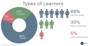
One more thing to remember:

Image Source: Xomly Blog
Lights, Camera, Conversion
It’s nice when users read your content, it’s even better when they convert into a customer after it. Remember to immediately shed light on your solutions, frame your information so users easily capture it, and give them the tools to take action and convert.
About the Author
Ashley Costello is a Digital Marketing Strategist at ChoiceLocal. Currently, she has a diverse background that includes experience with digital marketing, marketing research, web design, SEO, content development, and video editing. Her goal is to combine her skills to help companies grow, ideally acting as a liaison between marketing, sales, and IT.
She is also someone that wants to wear many hats to keep life spicy and interesting. In addition to the above skills, she plans on going back to school for Mortuary Science. As for her ideal ‘retirement’, a Storm Chaser.
“Dream big, work hard, and go for it all.”

